Today we want to present one of the latest open source projects that brings together expertise from the Geostatistics and Sensor Web communities. The new web application sensorweby successfully integrates the 52°North JavaScript SOS Client with the analytical powers of R and creates a new and completely open source software solution to create advanced analysis and visualizations of time series data.
Find out more about the project on GitHub or Open HUB and try out the examples pages on the Geostaticstics Community Demo Server and 52°North contributor IRCEL-CELINE.
R is a programming language and environment for statistical computing and graphics. It entails a vast amount of community-driven extension packages with a wide variety of analysis and visualization tools. If you want the latest and greatest in data analysis, then R is the place to go.
The sensorweby package uses the Shiny web development framework by RStudio and is an R extension package itself. If you have R installed, all you need to do is run an example application locally and execute the following commands:
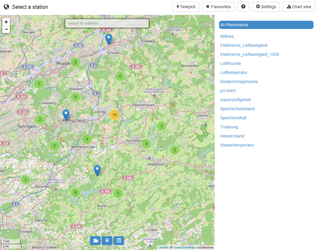
This will install the R package devtools necessary to install sensorweby and sensorweb4R from GitHub (see description of the architecture below), start a Shiny web server and open your web browser with an example application. You can use the JavaScript client functions just like the stand-alone version. The only change in the user interface is the added “Timeplot” button in the top menu.
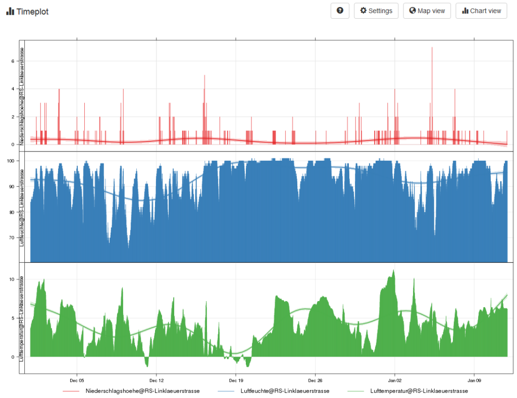
Click on the button after selecting one or more stations and a new screen appears. It is completely rendered by using plain R function calls with the same session information as the JavaScript application. Shiny has a large variety of user interface components, such as drop-down menus or buttons. In the screenshot below, you see the reason for the sensorweby implementation: after a specific time series in the map view has been selected, its metadata is transferred to the Shiny server component, analyzed and plotted. The figure created is returned to the web application asynchronously. The entire figure creation is done in R, so you can easily create very complex plots. Since all analysis is done in R and extensive Shiny documentation exists, domain scientists with little or no web development experience can create user friendly and focused analysis apps.
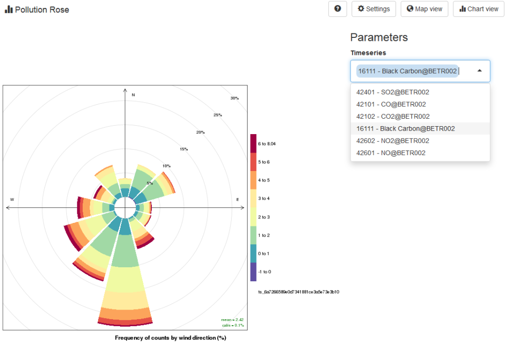
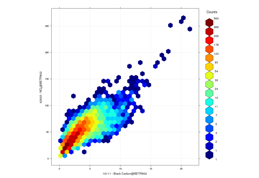
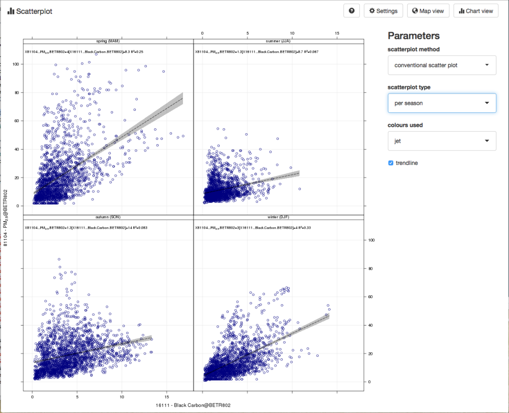
Two more example apps, created by the first sensorweby users in the Joaquin Project, are shown in the next screenshots. They use the R package openair, amongst others, to create plots for air quality analysis. The first shows a pollution rose for different pollutants, which can be selected from a dropdown menu on the right. The second displays a hexbin scatterplot of two variables.
The following code snippet demonstrates how the openair package’s scatterPlot function can be implemented with allowing the user a choice between different scatterplot types and other additional parameters.
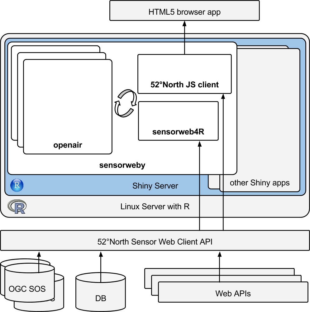
The architecture is shown in the figure below. The sensorweby package runs as a Shiny app, potentially next to other Shiny apps, on a Linux Server with R. It contains the latest version of the JavaScript client, which is delivered via the Shiny web server to browser clients. The app can run as a stand-alone website or can also be embedded into other websites using an iframe. When the user initiates an analysis through the UI, the respective R code is executed and the UI is automatically updated with the respective changes. The sensorweb4R extension package is used to query the same time series data from the Sensor Web Client API that the user selected using the JS client. The API integrates time series from many different sources, such as standardized OGC Sensor Observation Services (SOS), databases, or other web services.
Leave a Reply