Introduction
The Google Summer of Code for the year 2015, is over! And that was fast!
With the help of my August mentors, Benno Schmidt and Christian Danowski, I’ve been able to make some good progress towards building the WorldViz connection map module. This blog post is a continuation of my previous blog post which can be found here.
The aim of the WorldViz project is to set up thematic maps showing connections or dependencies between different spatial features. After the completion of the midterm evaluations, we have been working mostly on the WvizConnectionMapSceneX3d component and user interaction.
Features
There are three main parts to the Worldviz connection map module:
- the data file,
- the configuration file and
- the graphical scene.
The data file contains raw data and is supported in two formats: CSV and Pajek.net
The configuration file is XML-based and allows the user to change the parameters of various visual objects. For instance, a user can change the size of particular node, change the colors in which the connections are displayed and so on.
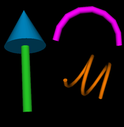
The graphical scene displays the connections/dependencies between different spatial features and is supported in two formats: X3D and X3DOM. Currently, only X3DOM supports the dynamic modification of objects. The graphical scene can be modified to have different connections such as arrows, ellipses and ribbons (see Fig. 1).
One of our final scenes looks as follows.
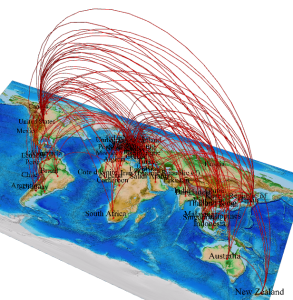
Figure 2 describes the export relationship between various countries. Doesn’t it make you feel, the world is actually a really small place?
User customization was one of the primary focuses of the project. All our components are designed to be easily modifiable. For instance, the colors and the widths of all the objects can be changed dynamically.
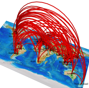
Use bigger widths for greater impact. 😉
We have added another feature, the ability to show only particular relationships for each node.
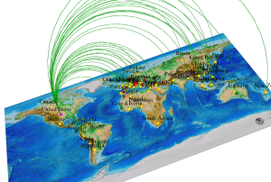
In figure 4, we have clicked upon United States (colored in bright pink), to show its export partners (colored in yellow). Each connection is assigned a certain weight (or relative strength). With respect to that weight, the color of each connection is different.
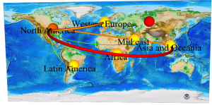
The image above indicates the flows of trade between different continents. There seems to be a lot of trade between North America and Asia. The continent also maintains a healthy trade relationship with Western Europe, however trade with Latin America is sparse.
In figure 4, we showed that if a node is clicked, only specific connections are displayed. On clicking a connection, the shape of that connection is also changed. After doing such changes, the image obtained can be exported. This feature is present in X3DOM scenes.
What’s left?
During the summer, we had wanted to tackle the task of finding a solution for overlapping connections having the same weight. Soon, we will have a solution! We will also be adding attributes which map each feature with a particular attribute, such as population and land area. Another interesting topic is how to deal with congestion in our scenes.
So, what is Adhitya going to do now?
He is going to continue working on this project. Who doesn’t want to do such interesting stuff? A research paper on this topic is also is the pipeline.
Remarks
I had lots of fun working on this project and the learning curve has been excellent. I’ve been extremely lucky to have worked with two excellent mentors. Both of them are really responsive and give appropriate solutions.
Leave a Reply