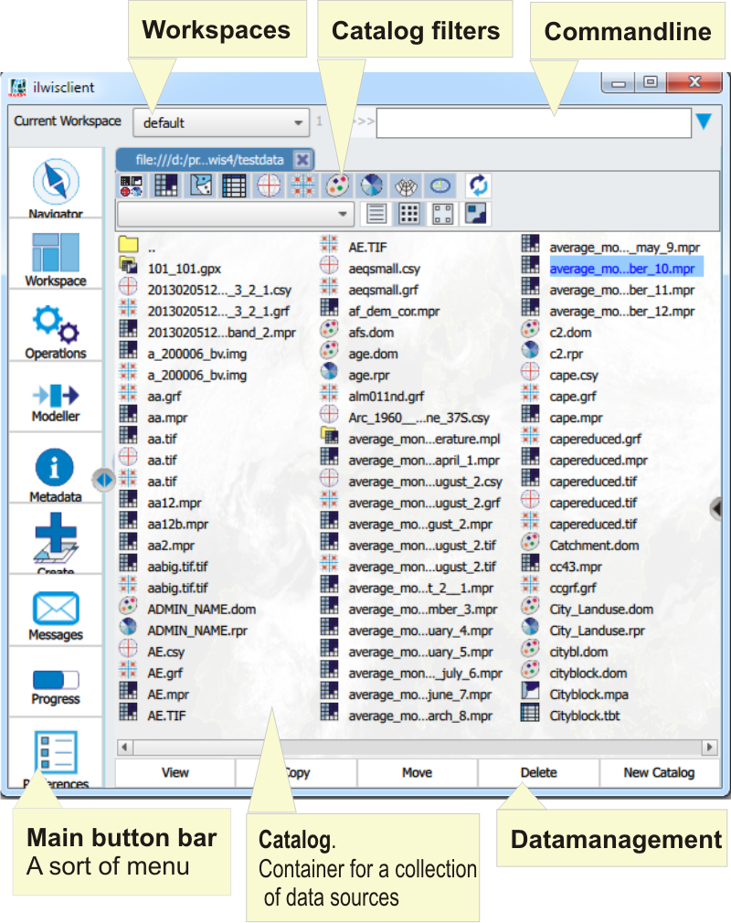
Last week I talked a little bit about the changes in the data structures. This week I want to show a little bit about the changes in the desktop client’s user interface (UI). When designing the UI, I tried to stay close to the general principle of the ILWIS 3 UI on the one hand, and to modernize and improve those parts that needed improvement on the other hand.
As I understood, one of the things our users really liked about the ILWIS 3 UI was the very short distance between having data, what can you with the data and visualizing the data. So that was something I had to maintain for Ilwis4.
 As you can see it looks familiar to ILWIS 3 – a catalog, command line, some filter buttons. On the other hand, the menu is gone and a big bar of buttons has appeared at the left. In a way this bar is a replacement for the menu. Most of the functionality that was in the menu can be found under the various buttons. For example:
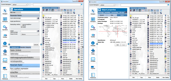
If you press the operation button, you get the operation list or tree. If you press the metadata, you get the old property form(s) in a new more conistent format.
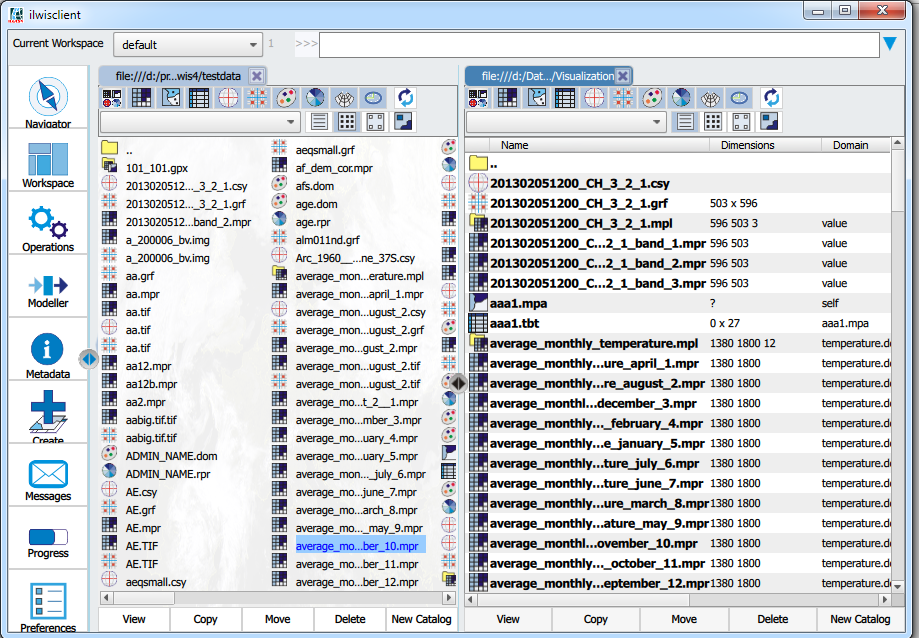
But what about multiple catalogs, like ILWIS 3? No problem for those that know it. Ilwis4 has roughly the layout of a program called a “totalcommander”. That means there is a splitview with two halves that are more or less independent.
Each half can contain an unlimitted number of tabs and, this is different from totalcommander, each tab can contain different objects. In the picture above there are two catalogs, but in the picture I showed a few weeks ago there was a catalog and a mapwindow. Anything is possible. When needed, the tabs (apart from the catalog) can be detached from the window and become a free floating window (just like in ILWIS 3). They are attached in the mainwindow by default.
One important note about Ilwis4: drag and drop is everywhere. There are no special forms or other ways to get your data to the place you need apart from drag and drop. Drag and drop works from the catalog(s) and so the catalog is a very central element in Ilwis4. In ILWIS 3, the catalog was nothing more than a simple view (filtered for ILWIS files) on a folder of your disk. In Ilwis4, the catalog is much more. It is any collection of data sources that “belong” together. This might be mandated by a simple physical reason, for example a folder on disk or a complex HDF5 file, or by logical reasons., e.g. the user wants to organize his data according to geographic and time filters. The data might be at different physical places but still forms one catalog.
There is much more to tell (and show) about this subject but that is for another post!


Leave a Reply