The enviroCar project allows users to collect and share their driving statistics via an OBD sensor coupled with an Android app. A new SPA (Single Page Application) is now available online (http://pilot.52north.org/envirocar-ng/) as an amendment to the enviroCar project. It builds upon work done by Google’s Summer of Code student Naveen Jafer (please find a summary of his work on enviroCar visual analytcs here). Users are invited to test the SPA and to fill out a feedback form regarding issues or to share ideas.
Current Features
Dashboard Page
The Dashboard serves as landing page after users have logged in successfully. General enviroCar community statistics and user specific statistics are presented here. In detail, the users are provided with
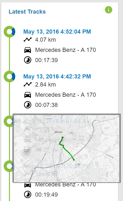
- a list of their latest uploaded tracks containing date, vehicle and distance of the track. If the mouse hovers over a track, a preview of the track on a map opens up:
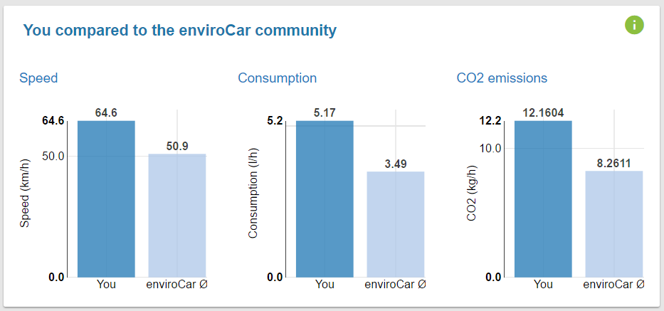
- a comparision of the user’s average speed, fuel consumption and CO2 emissions with averages of the enviroCar community:
- a weekday chart, showing the user’s driven distance distributed across the weekdays:
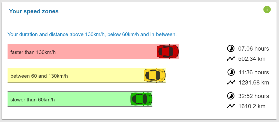
- and a speedzones chart, showing the covered distance and duration per speed interval:
A heatmap is currently under construction, which will then present the user’s footprints on a map.
Tracks Page
The Tracks page provides a calendar tab and a list tab of all tracks tab.
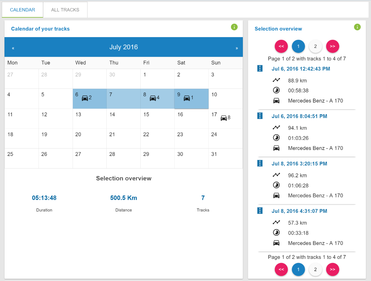
The calendar tab shows an overview of tracks for each day. Users can select a set of days, whose tracks are then presented in a pagination list:
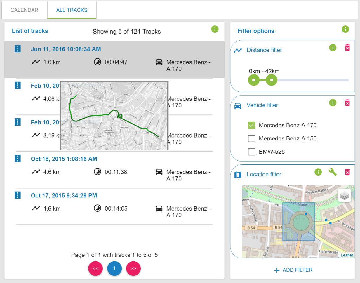
The list tab shows all tracks in a pagination list. Users can also set filters according to track date, distance, duration, vehicle, and/or location for the tracks shown:
Finally, whenever users click on a single track, they are redirected to the Single Track Analysis page.
Single Track Analysis Page
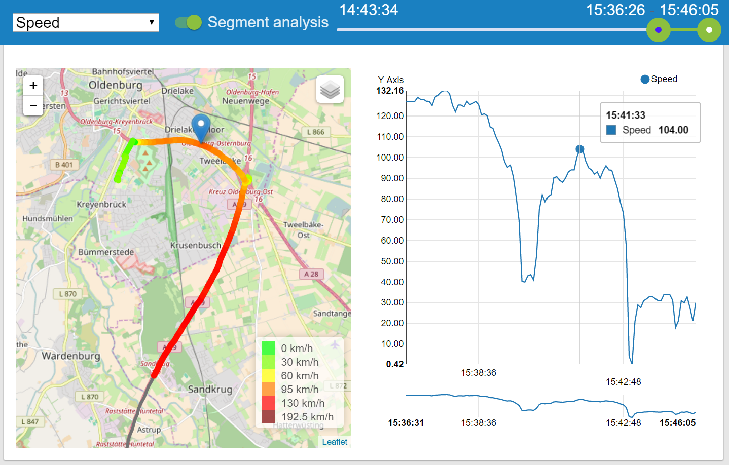
The Single Track Analysis page provides a lot of information regarding a single track. A map presents the driven route and highlights the segment in relation to the measured values. In addition, a time series chart presents the values. Hovering the mouse over the time series chart shows the location of the measurement on the map. A toolbar provides the features of selecting the presented phenomenon and switching to a Segment analysis. The segment analysis tool provides a range slider enabling the users to have a detailed look at parts of their tracks. The selected phenomenon and range update all charts of the single track analysis page to isolate their presented values according to the users selection.
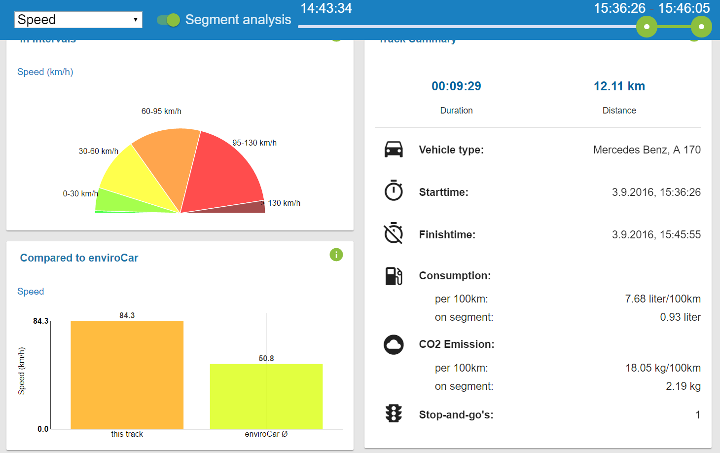
Furthermore, a comparison chart shows the average value of the selected track segment compared to the enviroCar’s community averages. An interval chart presents the percentiles of the track’s selected range. A track summary card additionally presents the track’s selected range’s duration, distance, start time and finish time, the fuel consumption and CO2 emissions per 100km and in total, as well as the number of stop-and-go’s.
The application currently supports the English and German languages. The project’s code structure simplifies an extension of more languages in the future.
The next steps are to provide interesting and cool features and tools for exploring and analysing anonymous community data in an extension of the application. We also look forward to developing full support for mobile gadgets, i.e. smartphones and tablets.
In response to user feedback, we will fix issues and implement new features.

Leave a Reply