Introduction
During my learning phase, I was attracted to a project idea that aimed to estimate various parameters in a driving journey, such as total fuel consumed, velocity or distance travelled. After some time of research, I started working on this project idea. For reference, I tested and evaluated some of the existing apps related to collecting floating car data in Google Playstore and hosted on GitHub. After a few days, I came across the enviroCar android app. I was delighted to see that features, such as car selection,GPS tracking, and logbook were implemented. These features were quite similar to my personal project goals. This made me feel that the enviroCar is the right place to contribute and enhance my knowledge.
After using the application for a couple of weeks and observing the development of the envirocar application in recent years, I found that in the past 2-3 years app development was mostly focused on adding new features and improving them. These features have significantly improved the functionality of the app. Currently, all basic features that help in investigating the user journey have been successfully implemented. Next development steps would be to improve the user experience such that all the features are used efficiently. Hence, this year I would like to focus on improving the user experience so that we can achieve a bug free and smooth use of the app.
First goal
Apart from solving some of the critical bugs and adding new features, one groundwork will be identifying and updating all the 3-party-libraries in the app. Deprecated libraries will be removed along with improvement in design.
One such example focuses on existing app dialogs. The deprecated Materialdialog.builder needs to be replaced by MaterialAlertDialogBuilder in order to improve the dialog’s design. I plan to add more dialogs in the areas needed and make the dialog implementation consistent across the app.
The changes I am planning to implement are described below. I will colorize the toolbar and add an extra icon to each dialog. This will help users to know the dialog purpose without going through the detailed text.
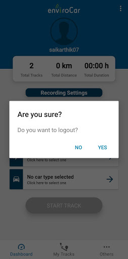
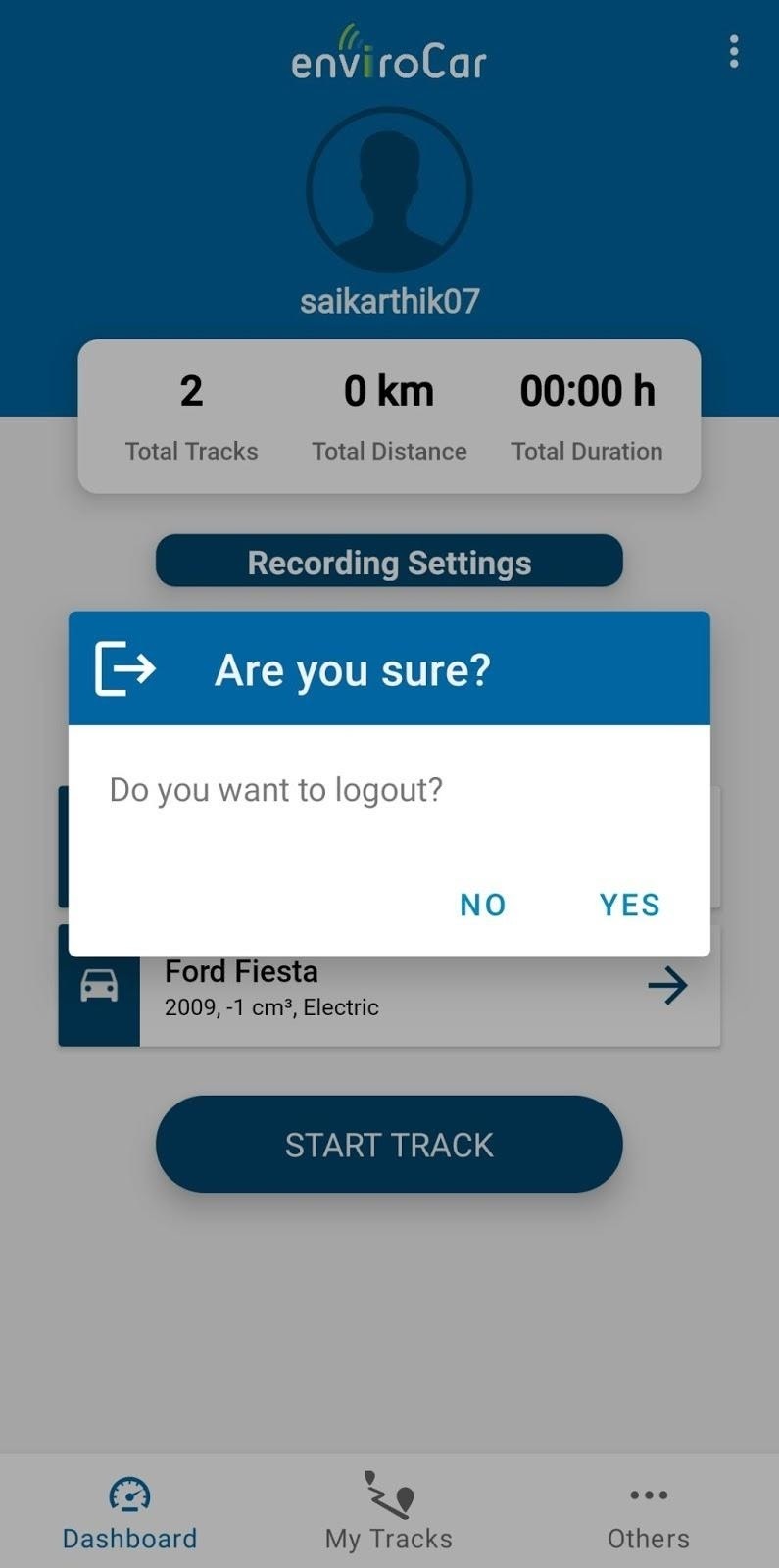
I will also work on particular cases when some tasks are not handled properly, for example:
- When a new bluetooth device is connected from the other device, the Paired Devices list in OBD is not updated simultaneously. The list is updated only after re-entering or refreshing the activity.
- To display the user log data in the logbook, we need an active Internet connection. The app doesn’t notify the user about the Internet connection status. Hence, we need to prompt the user to turn on the Internet if he tries to view log data while it is off.
- To discover new Bluetooth devices, we need location permissions from the user’s mobile phone. New devices are not discovered when either location permission or GPS is turned off. There is no notification about the need for location permissions and no dialog box is shown prompting the user to turn on GPS and allow GPS permissions.
Working on these will improve the existing implemented functionality. The current functionalities only work if the user has permissions granted or an active Internet connection. We have to handle all the possibilities to ensure that the functionality works perfectly.
Second Goal
I also plan to introduce new layout designs in Car Selection and Sign In/Sign Up activity.
Car Selection activity
We could replace the currently used list view with a recycler view and the components in the car could be specified in a more detailed manner. The recycler view is more flexible and has a more attractive UI than the current list view. In the current implementation, we don’t know what the depicted values indicate as they are listed in a single line. Implementing them with an icon associated with each value (e.g. for construction year or for engine capacity) will look more attractive and accurate.
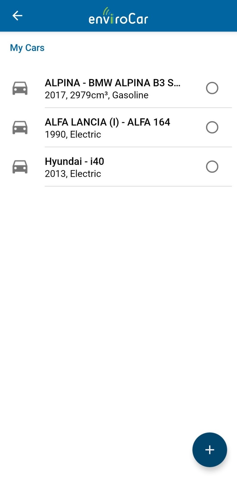
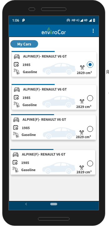
Sign In/Sign Up
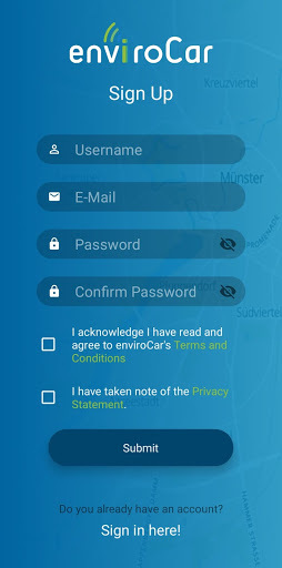
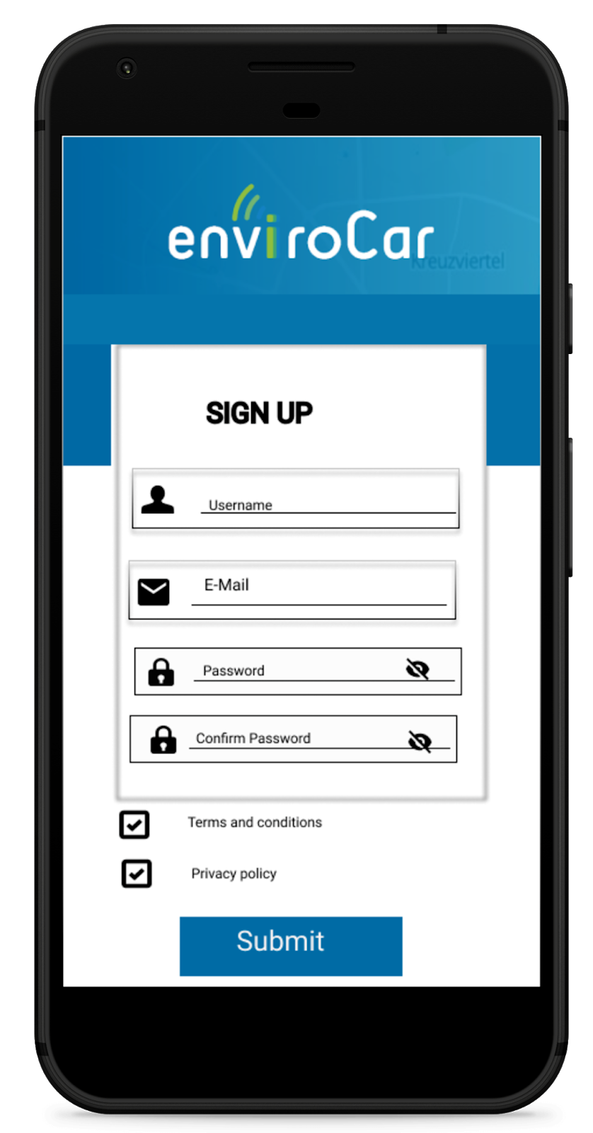
The current implementation of Sign In and Sign Up definitely needs a lot of improvements. We have to make the current implementation consistent with the rest of the app. I would like to improve the placements of the username, password and other text fields. It would be also possible to add more options for login (Google ,Facebook etc). However, these options would require changes on the server side.
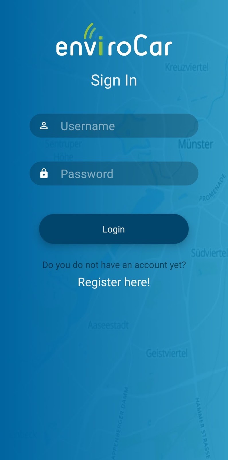
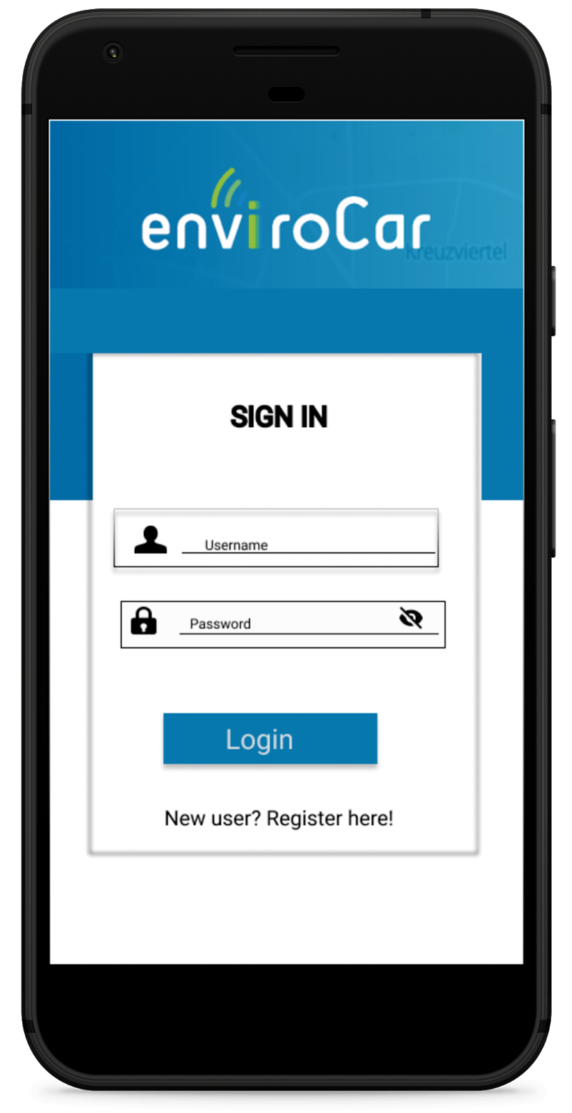
In the Sign Up screen, some of the hints are misplaced. In addition, the “Terms and conditions” and ”Privacy statements” checkboxes are currently implemented using dialogs. This is not a good approach. A recommended approach is to open these dialogs in web pages inside the app.
New Features
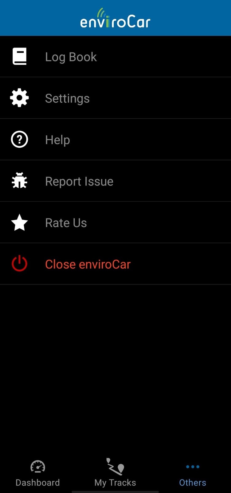
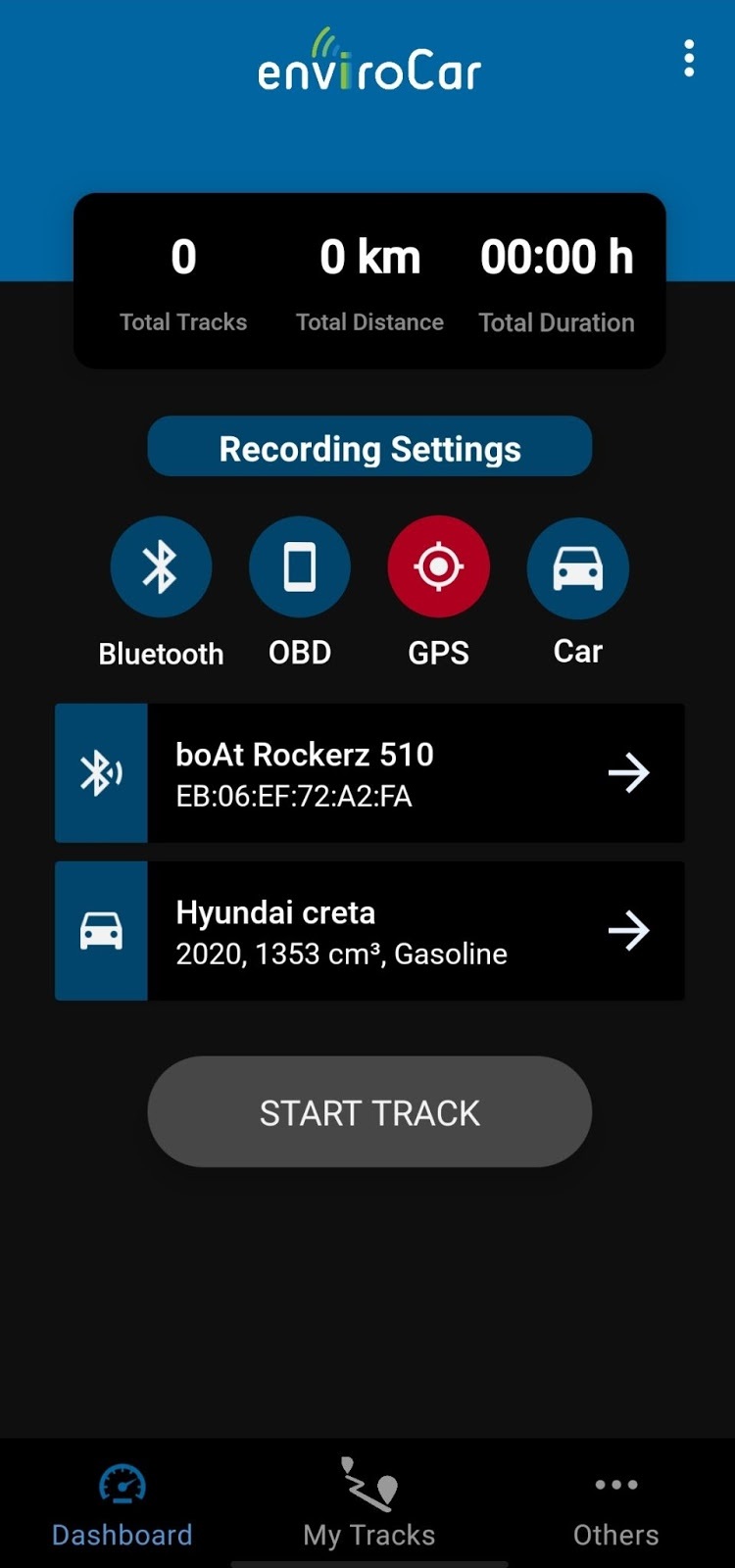
I will Introduce new features that will extend the app’s use cases. One will provide a dark mode.
The app currently does not support dark mode. I personally feel this feature is important, as this app is mostly used by the user when he is driving the car.
Driving at night with a bright mobile display in front of the user is pretty distracting. We can see this feature in Google Maps where the navigation/directions are turned to dark after sunset. Implementing this feature would be helpful for the users when they are using the enviroCar app in low light conditions.
About me
My name is Sai Karthikeya. I am a Sophomore studying Computer Science at a college affiliated to Osmania University Hyderabad, India.
I am passionate about technology, I like to develop apps that make our lives better. In my free time, I watch tech videos and explore various fields of Computer science. This is my first time in GSoC and I am very excited to work under the guidance of mentors Mr. Benjamin Pross, Mr. Sebastian Drost and Mr. Arvind Negi.
Leave a Reply