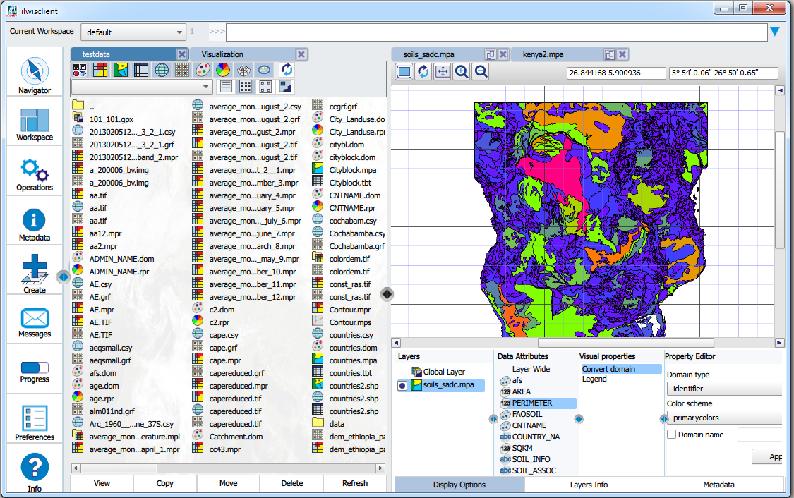
Apart from some decoration around it, the main Ilwis4 window has two parts: the workbench and the data panel. The workbench has been discussed, so this time I want to show some things about the data panel. The data panel is where, as the name implies, all the data is. Maps, tables, catalogs etc., the data panel is where they are rendered. In ILWIS 3, such a thing didn’t exist. The main window had a side bar for things like navigation and operations and an MDI (multiple device interface) part for all the folders that you want to access. Apart from the fact that MDI is considered to be old fashioned these days, the framework we use simply doesn’t have it. So another solution had to be found.
ILWIS 3 contained floating data windows. On the one hand, they are convenient. They give as much screen real estate to your data as needed. On the other hand, it disconnects you from the main window where all the operations and catalogs are. For 3.8, we made a kind of hack, to have at least the operations also available in the map window. But we were not sure if this was the correct solution (duplicating functionality seldom is). So we chose a different path for Ilwis4.
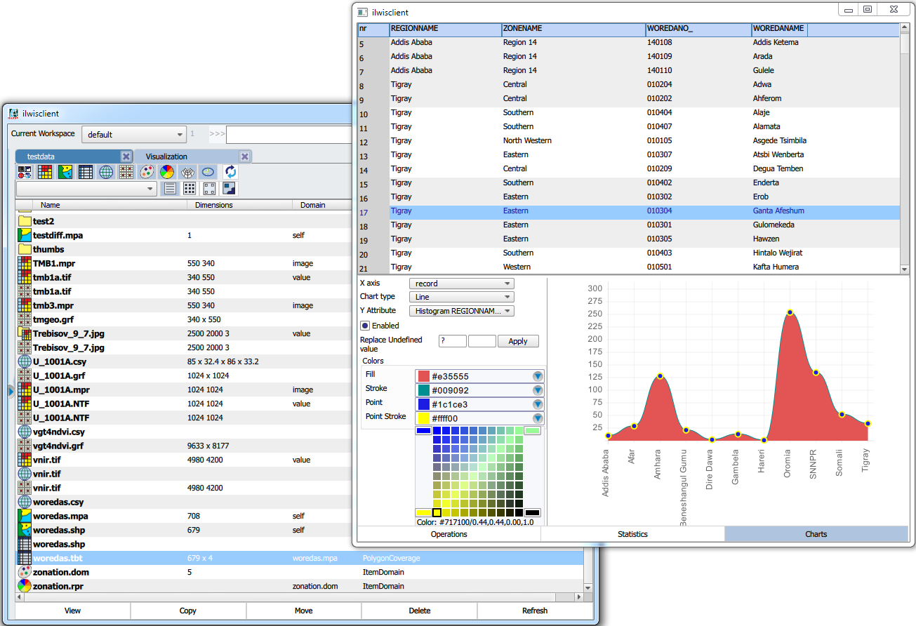
By default, all data opens in the main window. It can be detached/attached optionally from the main window to have the free floating data window. Another thing that needed to be solved was the opening of multiple catalogs, maps and tables in the same window. A simple solution would have been to just use tabs. This would have worked and is part of the solution. But we found that there was a certain disconnection between the data and the catalog (where the data came from). Furthermore, things like linked or related data panes would have become a little bit awkward. Sure you could have floated everything, but that would have defeated the purpose of creating a more coherent view of your data and its organization.
The solution chosen was to split the data panel (optional) into two seperate panes with identical functionality. You can have your visualization left or right, your catalog(s) left or right etc… Each pane can have as many tabs as you like. Data can be moved from left to right and vice versa, the pane can be moved from sides.
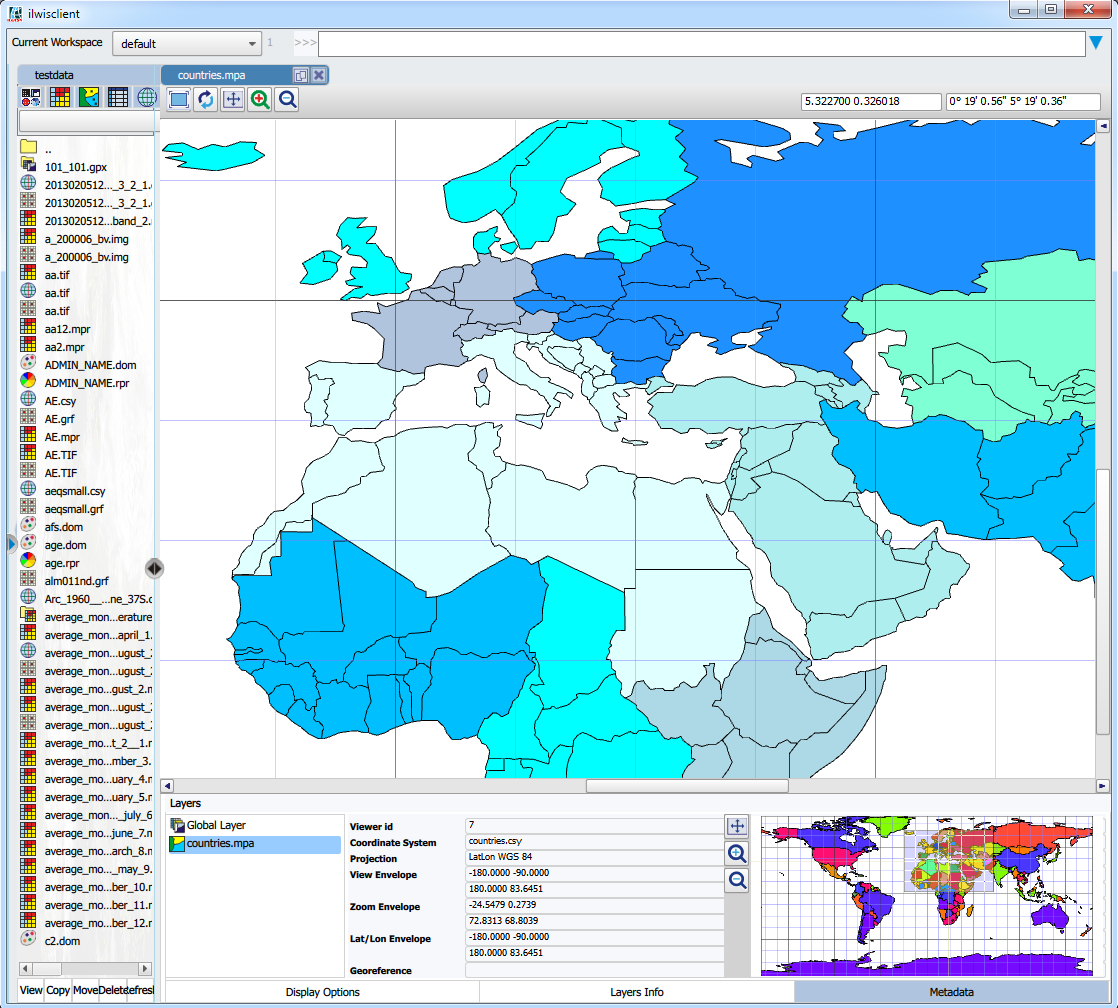
This is how it looks (at the moment, all these things have a tendency to change). Note that these things can change in size. The right (or left) pane could also occupy almost the whole data panel if needed.
The user can open data in any pane, but the default is, e.g. when you double click on a map in the left panel, it opens in the right panel (and vice versa). Adding layers is simply a question of drag and drop from any catalog to the map window. How the current map window works is something for a later blog (and it’s far from finished).
Note that we made the choice of having only two panes, left and right. Technically more panes would have been possible, but apart from that, we had the feeling it would made things far too complicated. The screen just isn’t big enough.
In the examples above, I used maps to show what is in the panels, but that could easily been a table or another catalog or a model or a … well anything. The last example shows the floating variant (for a table).


Leave a Reply