Introduction
The project aims to implement a UI for data privacy and control that will provide the user autonomy to control the data shared through the app and informed consent. For more detailed information, please visit my introductory blog post and GitHub. In the past few weeks, I’ve implemented the UI to inform users how their location data is processed and fixed the bugs.
Work accomplished
From the start of the coding period, I implemented the UI for data privacy and control settings and for informing the users about the location data usage. I created dialog boxes with appropriate messages about personal location information usage and a data privacy/control settings screen to select the preferences about data sharing. The specific tasks can be summed up as follows.
Project setup and upgrades
I updated all the dependencies used in the project to the latest ones. In addition, I fixed the GitHub workflows (iOS build failure) error by updating the dependency version used in the tasks.
UI Implementation ( Data Privacy and Control )
For achieving data privacy and control through UI, I designed the following widgets.
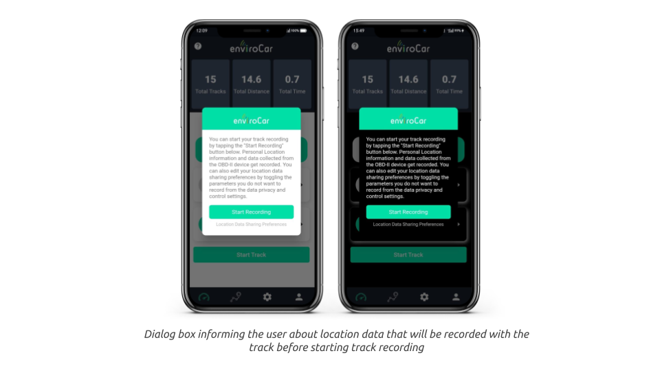
- A dialog box: Before starting the track recording, the box informs the user about what personal location information is being recorded along with the track.
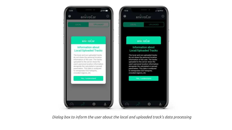
- The information icon: Click on the information icon on the track screen to open a dialog box. It informs the user of the location information stored as local track and uploaded track data and the scope of their Personal Location Information (PLI).
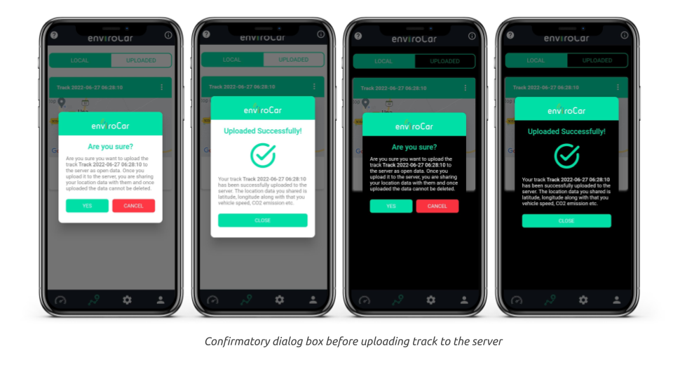
- A confirmatory dialog box: When the user tries to upload the track to the server as “open data”, they are informed about the potential risks involved in doing so and how the data uploaded is used.
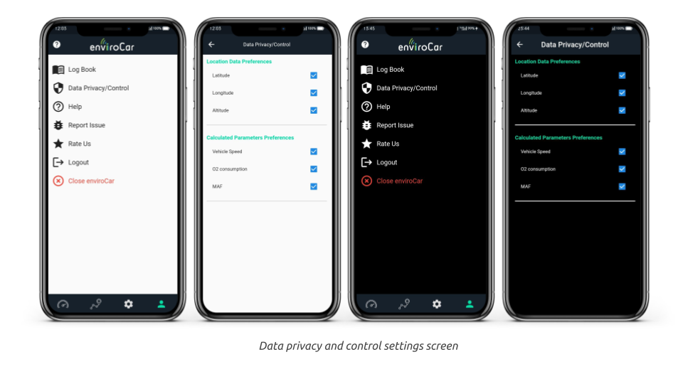
- Data privacy and control settings screen: I created this to navigate the privacy and control settings.
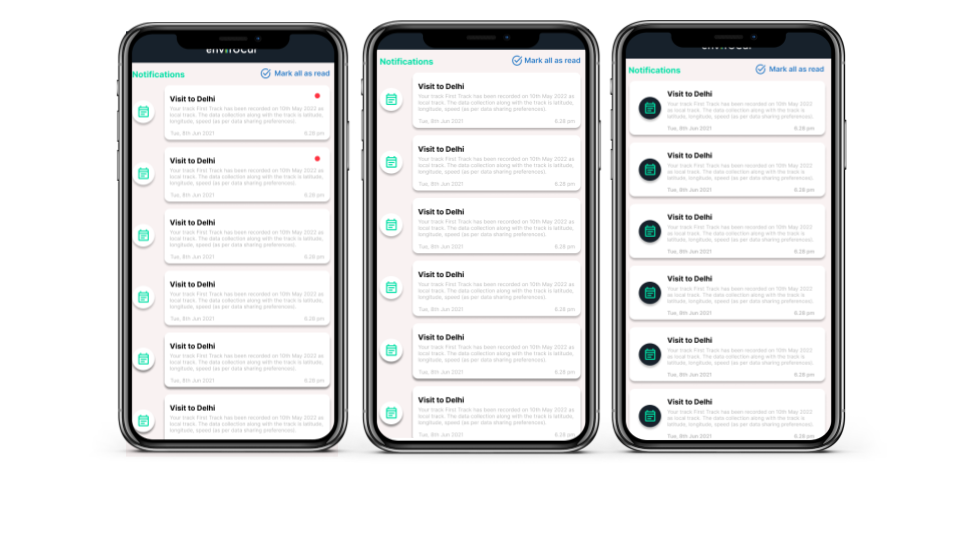
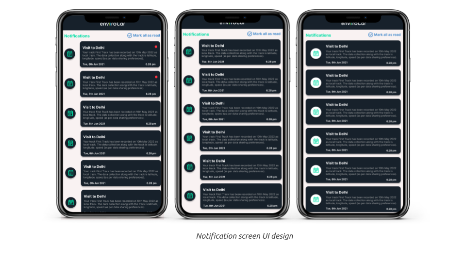
I have considered designing an individual notification screen to notify the user how and when the location data is processed. You would navigate to it via the notification badge on the dashboard screen.
UI improvements & Design
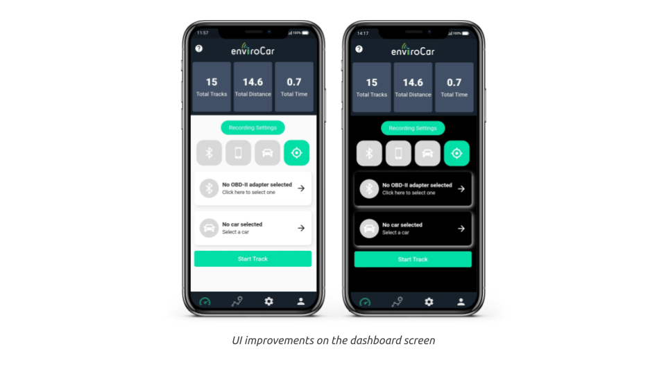
I updated the indicator color of disabled widgets on the dashboard screen and added an option to navigate to the data privacy and control settings screen from the profile screen. I used Figma to design the UI for the individual notification screen.
Bug Fixes
The track details cards had a few issues. One of them was that the track name visible on the track cards was not the actual track name, but a default one. Another issue was that the map for some tracks was not visible. I fixed these issues.
- Custom track name visibility: Earlier, all the tracks displayed the default track name despite explicitly saving the recording with a custom name.
- Map Loading on some tracks: A few map widgets were not getting loaded on the track screen due to a null object reference issue because no properties were encoded alongside the track data.
What’s Next?
The forthcoming tasks are:
- OBD-II communication implementation: The aim is to complete the implementation of the library to enable OBD-II communication via Bluetooth. And the parameters such as engine speed, vehicle speed, MAF, and fuel consumption can be calculated from the response data received as a result of the request.
- Bug Fixes: I will test the app thoroughly and fix all the issues.
- UI Improvements: I will improve the UI throughout the app and make all the widgets compatible in both dark and light modes.
Leave a Reply