As mentioned in my previous blog post, this project aims to add some new features to the enviroCar Android application. The app already contains features which display a car’s CO2 emission and speed. So in the first phase of my summer of code, I focused on modifying the existing dashboard and localization.
Dashboard
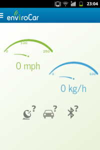
Previously, the app displayed CO2 emission values and speed values to be displayed on the dashboard as the user drives. Also the CO2 emission value is only available for gasoline cars (not diesel cars).
The following screenshot displays the dashboard of the original app.
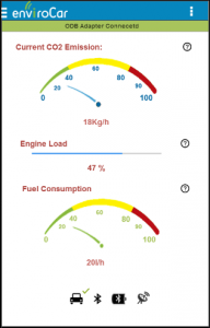
From now on, when a user selects a gasoline car, fuel consumption, CO2 emission and engine load will be visible on the dashboard. For diesel cars, speed is displayed instead of fuel consumption.
Fuel consumption, CO2 emission and engine load are three important units that are relevant to the user, although the app calculates several other data values such as MAF or intake temperature (the details are in this API). The screenshot below shows the dashboard for a gasoline car.
This dashboard actually consists of some customized views like this and this. I have made separate views for diesel and gasoline cars, and substituted it on the dashboard when the respective option is selected (replace View here)
Dashboard for Gasoline Cars.
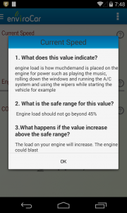
The user is also given general information about the parameters that are displayed on the dashboard. Currently, the text is temporary and the most relevant information will be decided. It will also change according to the units and language selected.
Work has been done to consolidate the information provided and make the app more user-friendly.
- Some of the similar options have been grouped, and placed in the overflow menu of the action bar (as shown in the dashboard figure above).
- The help icons at the bottom of the screen are more interactive in the sense that they represent a sequence the user should follow while starting the app. Also clicking them will take you to the respective feature (like “Select Adapter”).
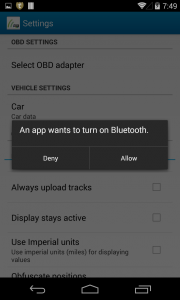
- Finally, while selecting the adapter, the app will automatically ask the permission to turn on Bluetooth without specifically going to the Bluetooth page.
Localization
The second important new feature is that the app has been localized in terms of units of measure and language. The default language is English and the default units for various parameters are displayed upon app start-up. A user can select from a provided set of units. Default units for various languages are in the project XML itself. Here are the default values for the German language.
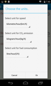
The application detects the locale and automatically changes its language accordingly. For different languages, there are different default units. We allow users to select a different set of units so that the userthey can choose the units he they areis most comfortable with in his languagewith. Different units are provided in an XML file and their values are parsed in Java. Thus the model is extensible and can accommodate a large number of units. Here is some code regarding this.
Profile Page
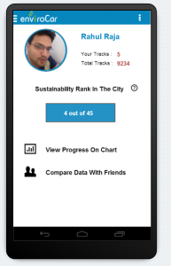
Those were the targets for the mid-term. Now a big upcoming part is the “MyProfile” section in the app. On the enviroCar website a user can compare statistics with other groups or users after the user logs-in. As shown in my mockups, this section will cover displaying to a user
- Their tracks,
- A sustainability rank in the city (how much less CO2 emission and fuel consumption he has over time),
- Statistics on a graph/chart,
- A comparison of data with friends, and
- A profile picture (of course!).
Afterward I will work on introducing some contrasting designs in the settings (user’s choice). Currently the app has major portions in white, which drain the battery. So we are aiming at a high contrasting background . In the last leg of GSoC, I will also work on some high priority bugs.
Great app!
However, there are some points for optimizations
First of all, I guess “CO2” is wrong, it should be an index-2. As I think this app has some kind of scientific background, you should really account for these details to be taken seriously!
There are also some issues with handling of units, these should for example always be seperated by a space character (e.g. “18 Kg/h”, or “kilometre/hour (km/h)”. Here are also discrepancies between BE and AE.
Furthermore, the small question marks may be too small to be considered as touchable objects.
Also, the selection of the color ranges for the tachometers seems to be arbitrarily, so to me, the previous dashboard appears to fit better.