I-CISK is funded by the European Union’s Horizon 2020 program as part of the European Green Deal, which aims to deliver tailored climate services (CS) in a trustworthy, understandable, replicable and effective way. As part of the project, we’re tackling climate challenges head-on in seven different regions across Europe and Africa. Each region presents its own unique climate hurdles that require tailored solutions. Here, we highlight our people-centered approach that emphasizes co-design, co-creation, co-implementation and co-evaluation across key sectors vulnerable to climate change. Our goal is to create tailored solutions that truly work for citizens, stakeholders and decision-makers.
As members of 52°North’s Spatial Data Science team, we will elaborate on our approach in one of our Living Labs, located in the region of Los Pedroches, northern Andalusia, Spain.
We began our collaboration with stakeholders by gathering user requirements from each Living Lab. This systematic process helped us frame the problem, identify relevant variables, and lay the groundwork for understanding the capabilities needed by CS users. An example of a user story is as follows: “As a livestock farmer, I’d like to have a visualization where I can see the historical time series (for specific stations) of temperature/precipitation data from the drought of the 1990s alongside the current downscaled temperature/precipitation forecast so that I can make informed decisions about my farming practices.”
Our team then uses these user stories to develop mock-ups. Based on the insights gained from the user stories and considering the level of experience of the end user, we helped to develop visualizations tailored to meet specific needs and improve the user experience. The initial mock-up studies were then improved over time with stakeholder feedback.
In the next chapter, we will introduce you to the array of Climate Services for which we’re developing the application:
Climate Service 1: Historical Climate Service
a. Point Monthly Data Visualization
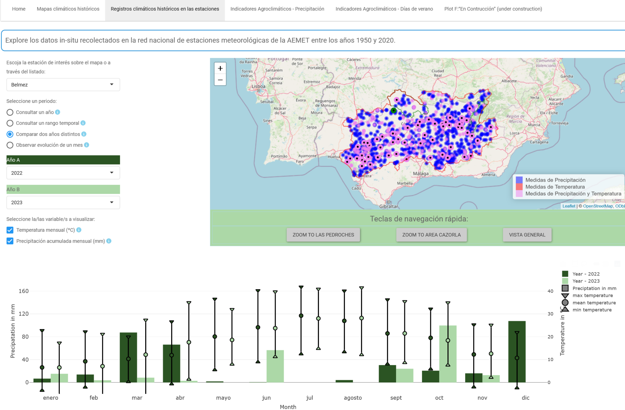
Our Historical Climate Service provides stakeholders access to historical data sourced from the AEMET weather stations network.
This app allows stakeholders to explore detailed monthly data from weather stations, featuring metrics such as total monthly precipitation and monthly min/max/mean temperature. Users can select two years for comparison, enabling them to compare historical and current data. In addition, they can pinpoint locations within the region by either selecting a region on the map or specifying areas of interest from a list of three predefined regions based on their preferences.

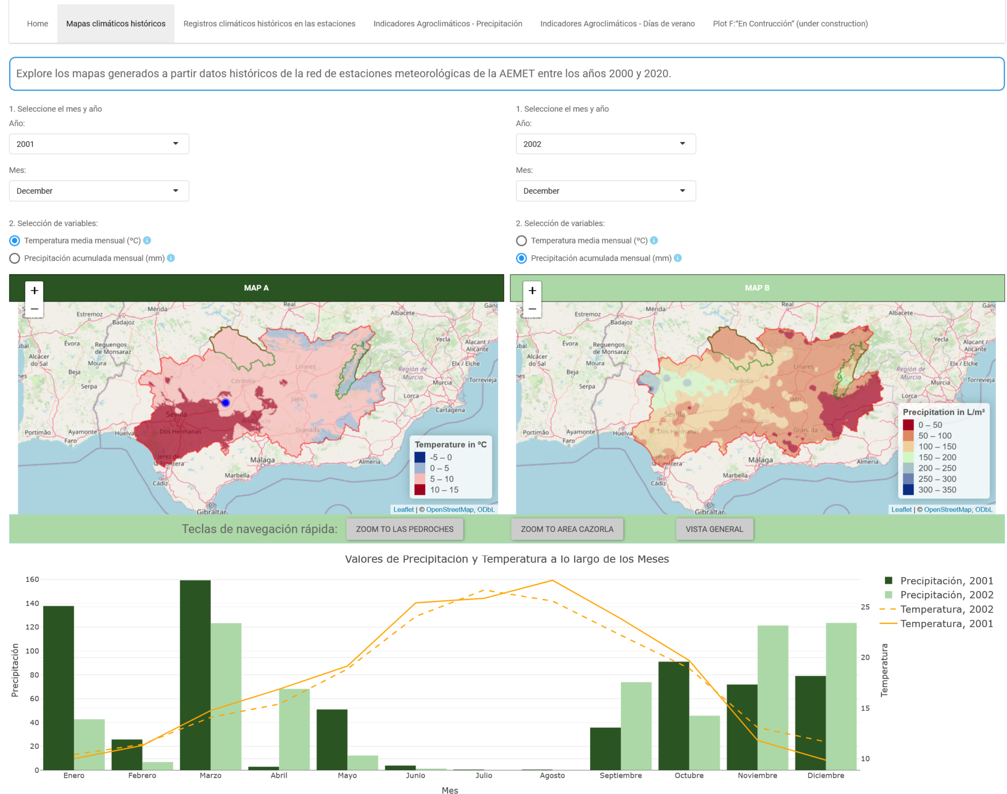
b. Raster Data Visualization
In a similar approach, this application displays raster data from the interpolated models generated from the point data at the weather stations. Users can interactively explore the map by clicking on a pixel to reveal a bar chart. The bar chart provides a comparative view of precipitation and temperature values at the selected pixel across all months for the selected years. In addition, users can use sliders to select a specific month and examine the total precipitation for that month.

Climate Service 2: Agroclimatic Indicators
The application provides access to a dataset of agroclimatic indicators used to characterize plant-climate interactions for global agriculture. The objective of this dataset is to provide these indicators on a global scale in an easily accessible and usable format for further downstream analysis and forcing of agricultural impact models.
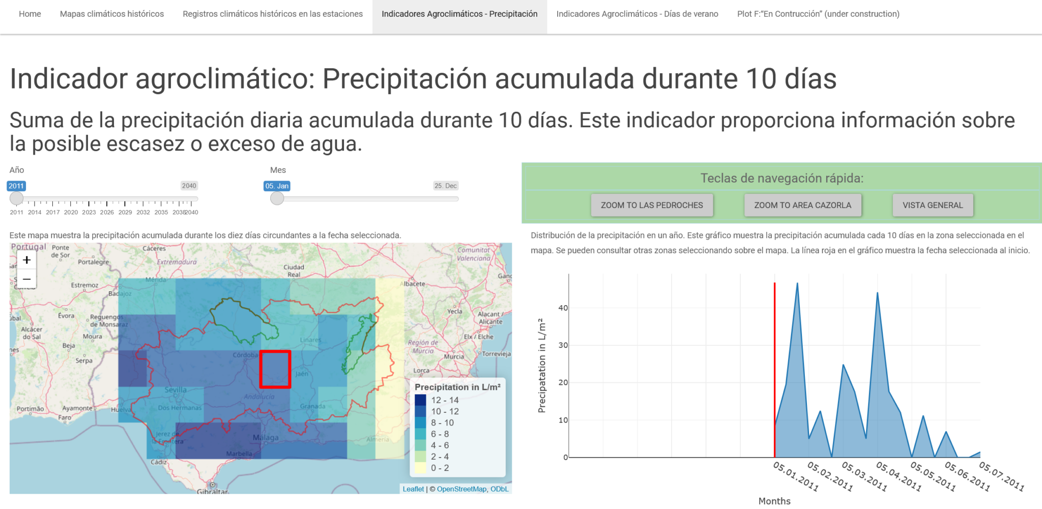
a. Precipitation Sum
This plot shows the sum of daily precipitation accumulated for 10 days. This indicator provides information about possible water shortages or surpluses.You can select a date with the two sliders. The checkboxes allow you to choose between two different scales for the map. The total precipitation for the 10 days surrounding the selected date (here 01.10.23 – 10.10.23) is shown on the map. You can also select a tile on the map marked with a red rectangle (left ordinal scale / right numerical scale).
The plot below shows the course of the total precipitation for the selected tile over one year, and the red line shows the selected date of the slider.

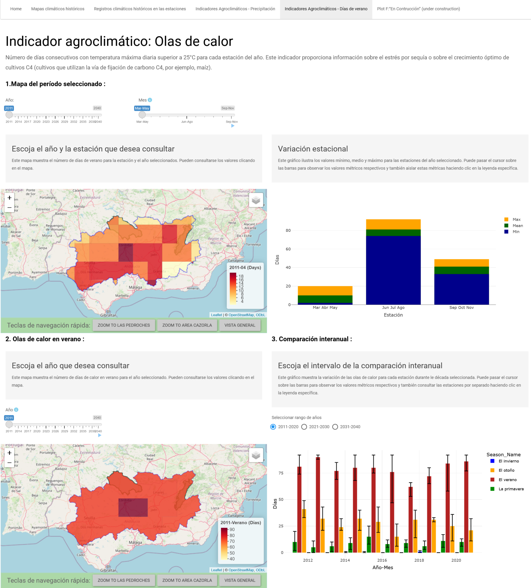
b. Maximum number of consecutive summer days (Hot spell)
The interface includes sliders for selecting a year and a month within that year. An interactive map displays values for the selected year and month, with tile clicks for details. A bar graph shows minimum, mean, and maximum values for the selected year. Overall, users can explore seasonal variations across years and months through interactive visualizations.

- The interface includes sliders for selecting a year and a month within that year. An interactive map displays values for the selected year and month, with tile clicks for details. A bar graph shows minimum, mean, and maximum values for the selected year. Overall, users can explore seasonal variations across years and months through interactive visualizations.
- The “Select Summer Year slider enables users to choose a year. Users can also activate the animate option, which plays through the years sequentially. The ‘Summer Map’ below displays the summer months for the selected year.
- The ‘Select Year Range’ button simplifies the decade selection for the time series plot, which categorizes months into seasons: DJF-Winter; MAM-Spring; JJA-Summer; SON-Autumn. The bar graph has top and bottom lines that represent maximum and minimum values, respectively, and bars that represent averages. Users can hover over the graph to view specific values and isolate seasons using the legend for enhanced interactivity.
The I-CISK Spain app provides farmers with critical insights into climate trends, enabling them to make informed decisions about adaptation strategies. With interactive visualizations and detailed data on precipitation and temperature, this tool empowers users to mitigate risks, optimize agricultural practices, and effectively manage the impacts of climate change.
Leave a Reply