Introduction
The project goal is to collect statistics about how the clients use their SOS (Sensor Observation Service) deployments. The data is collected in an Elasticsearch database. If you would like to read more about this proposition, please read the project’s first blog post. You can read about the performance and a couple of design decisions in the second blog post.
Demo video
Live demo server
SOS instance and the Kibana interface
Integration
The statistics collection feature’s codebase is mainly located in the iceland project. With this arrangement, it is possible to have this statistics module enabled in all upcoming iceland-based projects, like the SOS 5.x version.
A lot of functionalities are pushed to the iceland repository. In the future, application developers only need to subclass a couple of abstract classes to get the statistics module working for other OGC web service implementations.
Kibana diagrams
Most of the things happen behind the scenes. Since everybody knows that a picture says more than thousand words, flashy, colorful diagrams and charts about the application status can be seen in the Kibana interface.
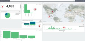
The intended default dashboard (52N Default Dashboard) shows essential information about the running instance’s status. Such as:
- the number of requests received in a given timeframe (#1),
- the geolocation coordinates of the user’s IP address (#2),
- successful and failed messages (#3),
- the performance of the instance measured by the maximum execution time of the operation (#4),
- average response document size in bytes (#5)
- and any other diagrams the user wishes to display.

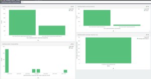
Dashboards have great power if we group the visualizations by theme. The most interesting and most requested operation is the GetObservation operation. The following dashboard shows interesting metrics about the request.
- Most accessed procedure (upper right hand-side)
- Most accessed observation property (upper left hand-side)
- Average response size (lower right hand-side)
- Temporal filter diagram (lower left hand-side)

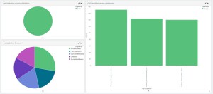
One last diagram for this blog post is the GetCapabilities diagram. It shows which version was requested (upper left hand-side) and what is the distribution of the sections (lower left hand-side). The diagram on the right-hand side uses scripted fields under the hood so it’s value is calculated on the fly. It shows in which combinations the sections were requested.

Shortcomings
There is always a lot of room for improvement in any software project. As the Iceland project matures, novel Elasticsearch functionalities will be added with the 2.x version. The Kibana project also grows a couple of handy features. User-friendly solutions can be implemented, such as:
- IPv6 support in Iceland,
- Geo_shape (not geo_point!) aggregation in Elasticsearch,
- Visualizations’ axis custom labels in Kibana,
- Processing more information about the application.
Final words
14 weeks was a perfect duration for implementing this kind of feature. My mentors were always helpful during this time and I can only recommend this company to my other fellow students if they ever consider to participating in the Google Summer of Code.
Leave a Reply